Lorem ipsum dolor sit amet, consectetur adipiscing elit. Aenean nec tincidunt purus, at dignissim est. Integer semper tortor id nisi porttitor ullamcorper. Duis consequat porttitor dui id luctus. Cras gravida metus sapien, eget ornare sem accumsan at. Donec vel tincidunt lorem, id gravida dolor. Pellentesque habitant morbi tristique senectus et netus et malesuada fames ac turpis egestas. Duis sed ex ultricies, placerat ante eu, congue nisi. Quisque blandit sit amet ligula eget rhoncus. Suspendisse gravida mollis lectus.
The challenge
Technical data from a renewable energy testing site is hard to understand. How can we make complicated, dull data interesting, accessible and enjoyable to users?
The process
I used the user-centred design process to ensure a smooth project rollout.
Discovery and research
We worked with Siemens and their data to break down what was needed – a way to make complex data engaging and fun.
Ideation and structure
We determined the best ideas involved exploration and glanceable data, with the option to view more complex data if desired.
Prototyping and testing
We developed a number of routes – and three key solutions to the data enjoyment challenge, each of which tested well with potential users.
Launch and user feedback
We launched the project, and it was enjoyed by a range of users from government level down. The final product solved the brief in three key ways:
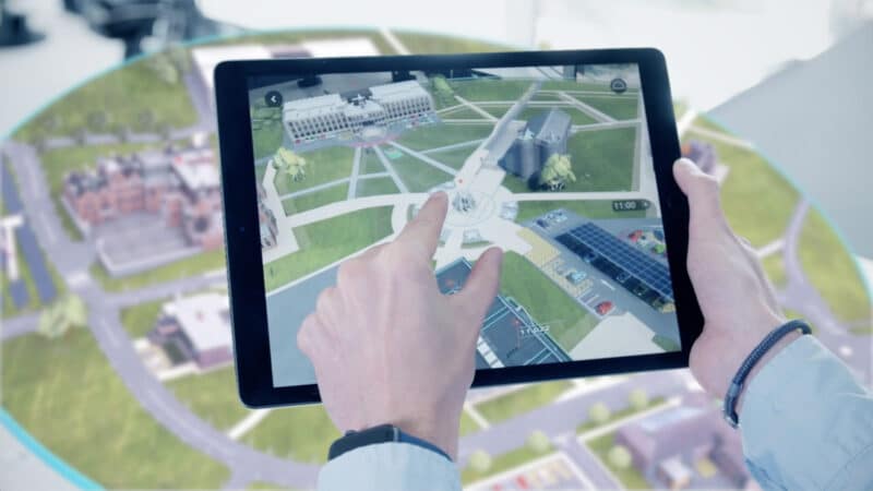
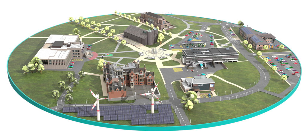
Solution 1
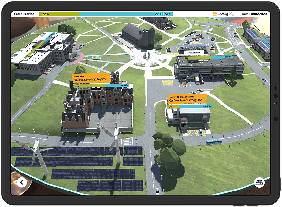
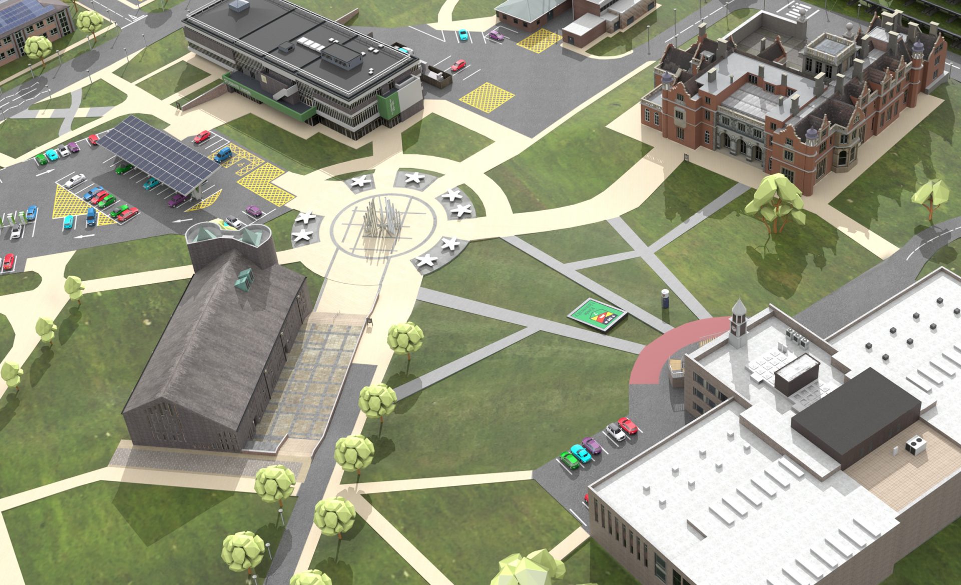
An explorable AR digital twin campus with recognisable buildings.
It featured a condensed campus layout and an intuitive pinch and pull interface allowing easy navigation.
Solution 2
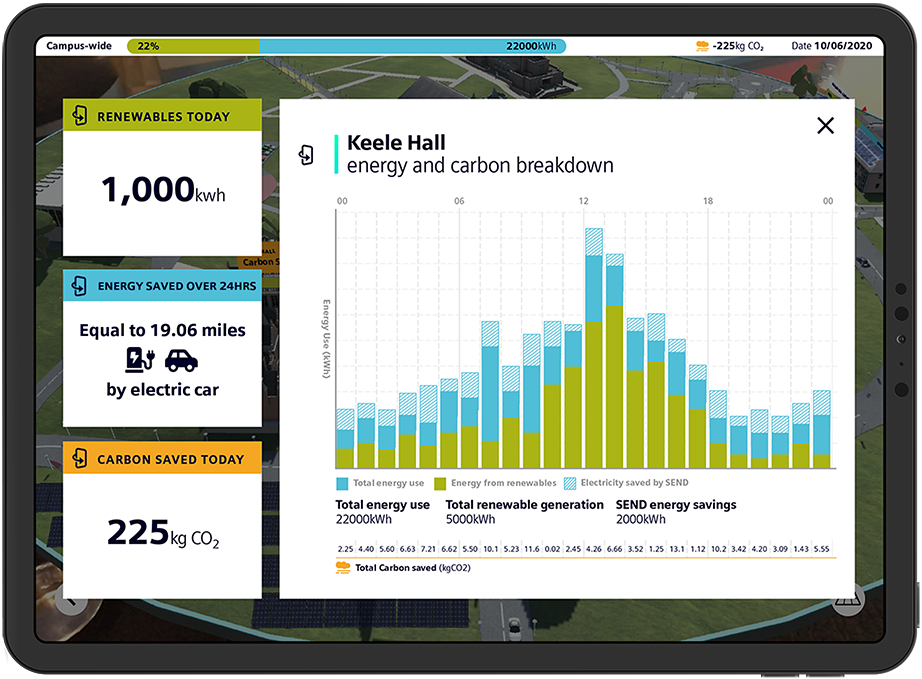
Multiple levels of data display for different user abilities.
We put data directly on buildings, visible whenever the tablet was pointed towards them. More data was available whenusers tapped a building, and we included an all-campus energy usage bar to show the overall impact.
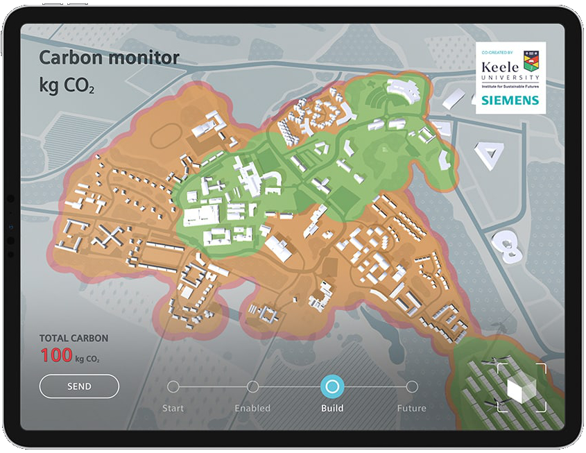
Solution 3
As the campus project was still underway, we included a heatmap that changed to show predicted energy and carbon use reduction over time.